
Things People Get Wrong When Reading Carrier Coverage Maps
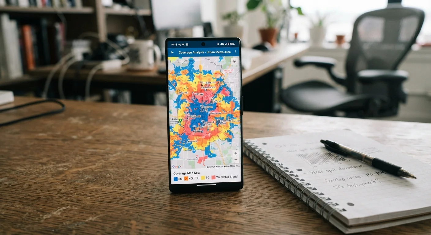
Photo credit: Telecom360.net | Connecting You To The Latest In Telecom
In this article
Coverage maps show potential signal, not guaranteed experience. Debunking the most common misreadings that lead to plan regret.
Key Takeaways
- Coverage maps show modeled signal potential, not guaranteed real-world performance at your specific location.
- Shaded map areas include indoor locations where buildings may block usable signal entirely.
- MVNO customers share network infrastructure but often receive lower data priority than postpaid customers.
- 5G coverage zones on maps frequently represent slower Sub-6 GHz bands, not ultrafast mmWave signals.
- Map accuracy varies by methodology - some carriers use drive-test data while others rely heavily on propagation models.
Why Coverage Maps Mislead Even Careful Readers
Carrier coverage maps are among the most consulted tools in the phone plan decision process, yet they are among the most misunderstood. The colored shading that blankets most of the continental US creates an impression of reliable, uniform service - an impression that rarely survives contact with reality. Understanding what these maps actually represent, and what they deliberately omit, is the first step toward making an informed carrier decision.
For a deeper look at how these maps are constructed, see our guide to how coverage maps are built and where they fall short. Below, we address the specific misreadings that most frequently lead to plan regret.
Myth
If my address falls inside the shaded area on a carrier's map, I will have reliable service there.
Fact
Shaded zones represent modeled signal reach under ideal outdoor conditions - they do not account for building materials, terrain variation, or network congestion at your specific location.
Coverage maps are generated primarily through predictive propagation models that estimate where a signal could reach based on tower location, antenna direction, and terrain data. They are not built from measurements taken at every address within the shaded boundary. Factors such as concrete walls, low-e glass, underground parking, and hillside shadowing can eliminate usable signal even in areas shaded as fully covered. For a closer look at how indoor environments specifically affect signal, see our article on why buildings block your signal and what helps.
Myth
All areas colored the same shade on a coverage map offer the same quality of service.
Fact
Identical shading can represent very different signal strengths, frequency bands, and congestion levels - a single color typically covers a wide range of actual performance outcomes.
Carriers use broad color categories - often just two or three - to represent what can be a vast spectrum of real-world conditions. A location at the edge of a cell's range may be shaded identically to one directly beneath a tower, despite delivering dramatically slower speeds and less reliable voice calls. Network congestion during peak hours further widens the gap between what the map implies and what a user experiences.
Myth
An MVNO that runs on the same network as a major carrier will give me the same coverage experience.
Fact
MVNOs access the host network's towers but typically receive lower data priority, meaning their customers are more likely to see reduced speeds during congestion - even in well-covered areas.
MVNO agreements grant access to a carrier's physical infrastructure, but priority rules embedded in those agreements generally place MVNO traffic behind the host carrier's own postpaid subscribers. During high-demand periods - sporting events, urban rush hours, emergency situations - MVNO customers may experience noticeably slower data while postpaid customers on the same towers do not. This distinction is absent from any coverage map.
Myth
A map showing 5G coverage means I'll get fast 5G speeds throughout that area.
Fact
5G coverage maps frequently combine multiple spectrum bands, and much of what is labeled '5G' uses Sub-6 GHz frequencies that offer only modest speed improvements over LTE in real-world conditions.
The term '5G' encompasses a wide range of technologies. Millimeter wave (mmWave) 5G delivers the multi-gigabit speeds most consumers associate with the technology but is limited to dense urban blocks and specific venues. The far more common Sub-6 GHz 5G - including the mid-band and low-band deployments that fill most carrier coverage maps - offers broader reach but speeds that often overlap with advanced LTE. For more on separating 5G marketing from technical reality, see our piece on common myths about 5G coverage, speed, and safety.
Myth
Coverage maps from different carriers can be directly compared side-by-side to determine which network is larger.
Fact
Carriers use different methodologies, data sources, and threshold definitions when generating maps, making direct visual comparisons unreliable without understanding each map's underlying standards.
One carrier may define a covered area as any location receiving a signal strong enough for basic voice calls, while another may set a higher threshold that includes minimum data speeds. Some carriers rely heavily on drive-test data collected along roads; others extrapolate coverage to surrounding areas using models. Because there is no industry-wide standard for what constitutes 'covered,' a map that appears larger may simply reflect a more permissive definition rather than superior infrastructure. Independent benchmarking organizations provide more comparable performance data than the carriers' own published maps.
What to Do With This Information Before Switching
Recognizing map limitations is only useful if it changes your evaluation process. Before committing to any plan, cross-reference coverage claims with independent speed-test databases such as those maintained by the FCC or third-party measurement platforms. Seek out community forums specific to your ZIP code and device type - crowd-sourced signal reports surface dead zones that no carrier map will volunteer.
~30%
Indoor locations with degraded signal in covered zones
FCC and academic propagation studies have consistently found that a significant share of locations within carrier-defined coverage areas experience materially reduced indoor signal due to building materials and construction type.
3-4×
Speed difference between peak and off-peak hours on congested cells
Network performance measurement platforms routinely record throughput variations of three to four times or more on the same towers depending on time of day and local user density.
Trial periods, where available, offer the most reliable test. Using a plan for 15 to 30 days across the locations you actually frequent - your home, workplace, commute corridor, and any regular travel routes - produces evidence that a map simply cannot. Our practical guide to testing real-world network coverage walks through that process step by step. You can also use our pre-signup coverage checklist to independently verify a carrier's promises before you sign anything.
Trial Periods Have Conditions Worth Reading
Many carriers advertise trial periods, but the terms often limit which plan tiers qualify, require returning a SIM or device within a narrow window, and may not refund activation fees. Read the specific terms of any trial offer before assuming you can test service risk-free. Our comprehensive pre-signup coverage guide covers what to verify before committing.
For a broader look at how coverage assumptions translate into costly decisions, see our article on coverage assumptions that cost mobile users the most, and explore the full Coverage and Network hub for additional context on 5G, LTE, and rural service differences.

Author
Phone Plans Editorial Team
Phone Plans Editorial Team is the collective byline for our editorial team and contributor network. Articles published under this byline or an editorial pen name are researched, written, and reviewed according to our editorial standards for clarity, consistency, and independence before publication.
View all articles →